Have fun teaching,
on brand every time.
A warm, playful design system for Have Fun Teaching — built for the pre‑K–6th grade teachers and homeschool moms (women 20–45) who use us every day. Built around the new pinwheel brandmark: four sails, four subjects, one motion. Every color in this kit is sampled straight out of the logo.
Every new page, post and email feels like this.
Our newest pages set the look for everything we build next: warm cream backgrounds, big rounded cards, chunky Fredoka headlines, real resource covers fanned out like a deck of cards, and playful stickers that bob and tilt. It feels like opening a fresh pack of classroom supplies. Use this section as the rulebook for new blog posts, landing pages, emails and site elements. Where an older section below disagrees, this one wins. Buttons and the buy box for every product and viewer are in 04 and 04B.
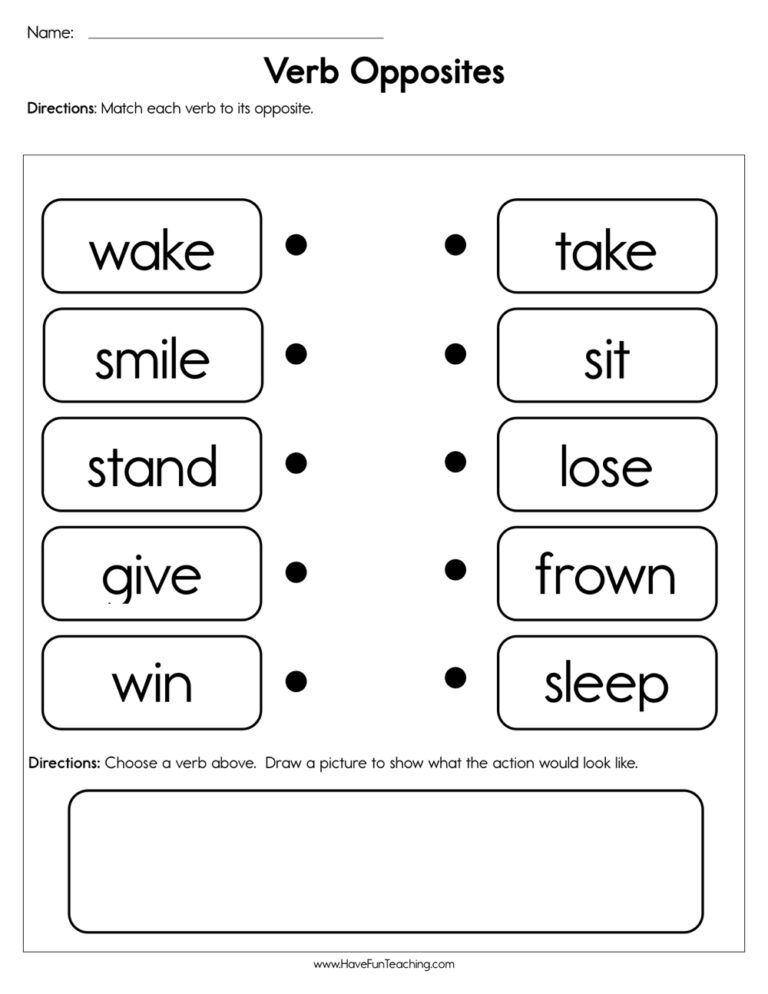

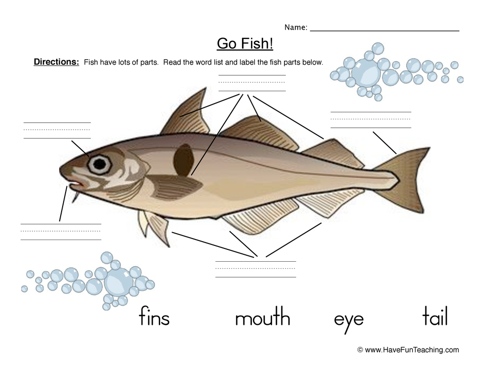
Fun on the surface. Disciplined underneath.
Every v3 page follows these five rules. If a design breaks one, fix it before you publish.
The visitor sees the main offer and can act on it without scrolling: free bundle first, membership second.
Fanned resource covers, gallery tiles and video thumbnails. Never stock photos or clip art.
Pick one accent (a grade colour or pink). It drives the eyebrows, pill, chips, number badges and the tinted bands.
Small tilts (±1° cards, up to ±12° covers), soft blobs, and no more than two stickers per hero. Keep plenty of white space.
Pink is only for the main action. Secondary actions are navy-outline ghosts. Every CTA says exactly what you get.
The 7-band recipe
Each band has one job and its own background, so the page reads in clear, colourful chapters. Every section opens with the same head: eyebrow (accent, caps) → Fredoka H2 → one-line sub, centred.
- Hero. Pill → kicker (the dream) → H1 with one highlighted word → mix line → the form or main CTA → trust line. Fanned covers + stickers on the right.
- What’s inside. Big real covers on 4:5 white tiles, numbered badges, subject · format tag, then one CTA under the grid.
- Imagine this. Three solid colour “dream” cards (accent / navy / green) that sell the outcome, not the product.
- How it works. Three white step cards with a tinted icon tile and a big faded number. Headline formula: “Three steps. Zero prep.”
- Membership. Navy band, yellow eyebrow, yellow check list, Yearly card raised with a yellow ring and “Most teachers pick Yearly” badge. Always add “$0 today · cancel anytime”.
- Guarantee + FAQ. 100% HAPPY seal card, then rounded
<details>cards that get an accent border when open. - Final CTA. One big Fredoka line, one sentence, one pink button. Nothing else.
The hero, exactly as it should look
Hover the covers, they fan out. The “10 FREE” sticker bobs on a 5-second loop. This demo uses the Kindergarten accent (#D2470B / tint #FDEBDD).
The year they learn to read. Make it magical.
7 worksheets · 2 activities · 1 video, hand-picked by teachers and ready to print tonight. Free, no credit card.
 ▶
▶Pressable, shiny, impossible to miss
The main button looks like a real button: pink, with a darker pink bottom edge. On hover it darkens; on click it presses 3px into the page. Trial buttons also get a light shine that sweeps across. Try it.
0 4px 0 #A4235C. Hover darkens to #B62A67 and never moves; a click presses it 3px down. Shine (.hft-shine) only on trial buttons. Nunito Sans 800.The little bits of joy
Stickers are the “fun” in fun and interactive. Each one has a white border, a soft drop shadow and a slight tilt. Use up to two per hero and one per card.
Show the real thing, big
Covers sit on white 4:5 tiles that alternate ±1.2° and straighten when you hover. Above each title is a small caps “Subject · Format” tag in the accent colour. Sits on the accent tint band.
Sell the feeling, then the product
Phonics pages that make that “I read it myself!” moment happen sooner.
Counting and number sense through pages that feel like play.
No more late nights hunting for the right worksheet. It’s already here.
Order: accent → navy → green. If the accent is green or navy, swap that card for purple #7A3FA8.
Three steps. Zero prep.
Your bundle is already matched to your grade.
Name, email and a password. No credit card, ever.
All 10 open instantly and stay in your account.
Tilted cards, coloured icon tiles
Use these for “what you get” lists. White cards alternate ±1°, each with a solid icon tile and a faint matching circle in the corner. They sit on a soft pink band (#FCE4EF).
Unlimited downloads, ready to print.
The catchy songs kids ask for again.
Practice that feels like play.
Preschool–6th, added daily. Ad-free.
The second offer, always in navy
Unlock every resource, in every grade.
- Entire library & unlimited downloads
- Printables, games, songs & videos
- Use with your class or your kids at home
You save $79.67 every year
Start My 3 Free Days$0 today · cancel anytime
Prices shown are today’s. On live pages, always pull them from hft_pricing_config(). Never type prices by hand.
Good to know
Is it really free?
Yes. All 10 resources are free to download and keep. No credit card, no trial, nothing to cancel.
Can I use them in my classroom and at home?
Absolutely. Every resource works for teachers and for families at the kitchen table.
Will you email me?
Only helpful things: new free resources and teaching ideas. Unsubscribe anytime.
Landing-page accents
Each page uses one accent and its light tint. Grade pages use their grade accent. Hub, pricing and general pages use pink. Blog posts use the grade accent when the post is for one grade, otherwise pink. Click a swatch to copy it. Note: these are page accents. Catalog card tags still use the colours in 02b.
Fixed on every page whatever the accent: navy #1B437D headings, pink #D6337B main buttons, sail yellow #FBB915 highlights & checks, cream #FBF5EC / #FFFCF6 backgrounds, line #E9E0D4, slate #5A6B7D fine print, body text #3d4a57.
The numbers behind the fun
| Token | Value | Used for |
|---|---|---|
| H1 | Fredoka 700 · clamp(40px, 5.6vw, 72px) · line 1.02 · −0.02em | One per page. One <em> word in the accent with a yellow highlighter swash (−1.5°). |
| H2 | Fredoka 700 · clamp(30px, 3.6vw, 46px) · line 1.08 | Section headlines, centred, balanced wrap |
| Eyebrow | Fredoka 600 · 15px · caps · 0.08em | Accent colour (yellow on navy) |
| Kicker | Fredoka 600 · 20–26px · accent | The emotional “dream” line above the H1 |
| Body | Nunito Sans · 17–21px lede · 15–17px cards · 1.55 line | Body copy #3d4a57. Bold words in navy. |
| Radius | Covers 16–18 · FAQ 20 · cards 24–28 · bands 30 · buttons 999 | Everything is rounded. No sharp corners anywhere. |
| Shadow | 0 18px 40px −18px rgba(27,67,125,.35), 0 4px 10px rgba(27,67,125,.06) | Cards, covers, plans. Navy-tinted, never grey. |
| Width | Wrap 1240px (gallery 1380px) · text max ~42em | Section padding clamp(64px, 8vw, 120px) |
| Motion | Cards & tiles lift 6px on hover · buttons never move on hover, they press 3px on click · stickers bob 5s · trial buttons shine every 5s | Turn every animation off for prefers-reduced-motion |
| Tilt | Cards ±1–1.2° · covers −11°…+9° · stickers −12°…+7° | Tilted items straighten when you hover them |
Same look on pages, posts and emails
Same components, three homes. Never invent a new colour, button or card. Reuse what’s already here.
| Where | How to build it | Class family |
|---|---|---|
| New landing page | Theme template that loads hft-free.css. Copy the /free/<grade>/ structure and set --fb-accent / --fb-tint on <main>. | .hft-fb-* (+ .hft-pr-* for pricing parts) |
| Blog post | Blog POST-TEMPLATE v2 (“Free Bundle” style) in the Code editor. Its inline <style> mirrors these tokens. Hero art shows only what the post is about. Keep the “On this page” box. | .hft-bp .bp-* |
| Hand-built to look like the post: cream bg, Fredoka heads, one pink button. Buttons stack full-width on mobile, never squeezed side by side. | Email template (inline styles) | |
| Small site element | Pill, sticker or card on an existing page. Use the tokens above and the shine class on trial buttons. | .hft-shine, brand vars in hft-brand-2026.css |
Map: hero .hft-fb-hero ↔ .bp-hero · pill .hft-fb-pill ↔ .bp-pill · kicker ↔ .bp-kicker · swash ↔ .bp-swash · stickers .hft-fb-sticker ↔ .bp-sticker · gallery ↔ .bp-gallery · steps ↔ .bp-steps · plans ↔ .bp-plans · buttons .hft-fb-btn ↔ .bp-btn.
Warm, short, specific
Write to teachers and parents. Sell the dream first, then make the offer concrete. Only use claims the site already makes: 10,000+ resources, 2M+ teachers & families, 20+ years, Preschool–6th, 3 days free. Never make up testimonials or numbers.
🎁 Free for preschool teachers & parentsWho it’s for. White, accent text.
Little hands. Big discoveries.The dream, in five words or fewer.
Get 10 free Preschool resourcesA concrete offer with one highlighted word.
Three steps. Zero prep.Short, rhythmic, confident.
Send me my 10 free resources →First person, says exactly what you get.
$0 today · cancel anytimeSlate, small, middle-dot separators.
Do this. Not that.
- Put the main offer and its button above the fold
- Use real resource covers and video thumbnails as the art
- Pick one accent and use it everywhere on the page
- Give each band its own background (cream, tint, navy, white)
- Make CTAs state-aware: visitor → free offer, claimed → membership, member → My Library
- Check the page on a phone. Buttons stack and nothing scrolls sideways.
- Fall back to a plain wall-of-text layout (that’s only for legal pages)
- Use stock photos, clip art or worksheets the page isn’t about
- Mix two accents, or use pink for anything except the main action
- Use more than two stickers in a hero, or tilt things more than 12°
- Make up prices, stats, quotes or reviews
- Show member wording (“Go to My Library”) to a visitor
Start from the Free Kindergarten page. It has every v3 piece in one place.
Open the master template →Designed for the teacher who does it all
Our audience is women aged 20–45 who teach little kids — Pre‑K through 6th grade: classroom teachers and homeschool moms, often juggling many students, lesson plans and limited time. She wants resources that feel warm, joyful and reassuring — colorful enough to delight her kids, simple enough to use at 9pm. v3 leans into rounded shapes, warm cream, generous whitespace, and one obvious next step on every screen. Trust cues (2M+ teachers, 20+ years, free samples) sit on the call‑to‑action, not near it — see 05b — Conversion patterns, which is where this audience actually gets served.
How the brand grows up
There is one brand, not three. But the same ingredients — color, shape, type, tone — are dialed by grade band. Younger runs warmer, rounder and more colorful; older runs cooler, tighter and more editorial. The house default is the Elementary setting — warm, rounded and friendly — because that’s where most of what we make lives (Pre-K–5th). Push cooler and tighter only as the grades climb.
Shape: round, pill buttons
Type: Fredoka leads
Voice: playful, friendly
Shape: 8px, tags stay pills
Type: Source Serif headlines
Voice: plain, respectful
Shape: 6px, minimal
Type: Source Serif, tight
CTA stays pink — every band
Logo system
The identity is the Have Fun Teaching sticker logo: a glossy four‑blade pinwheel — pink, yellow, green and blue sails spinning around a cream hub — beside a chunky, bouncy one‑line wordmark. “Have Fun Teaching” sits on a single line in solid logo blue (#1C437D), evenly spaced, at about 90% of the pinwheel’s height. The same blue outlines every shape and a white sticker edge wraps the whole thing, so it pops on any background. Four sails, four core subjects, one motion. Loud enough for kids, grounded enough for teachers and parents — the blue is what keeps it grown‑up.

The default. Site header, worksheets, decks, email, merch, social. White sticker edge plus a soft shadow, so it lifts off any background — light, dark or photo.
Same file as #1 — no reversed version needed. The sticker edge does the work on blue bands, footers, video and photos.

The sticker logo without the shadow. Use it where a shadow would look muddy — small print, embroidery proofs, flat UI.

White or very light backgrounds only, where the white edge would just be empty space. Never on dark or busy backgrounds.

Black‑and‑white printing that should keep the shading and gloss — B&W worksheets, newsletters, photocopies.

Single‑ink line art on a transparent background. Stamps, engraving, embroidery, vinyl cuts, fax, single‑color print.

White line art for dark backgrounds where full color competes — video overlays, dark merch, one‑color screen print.

Single‑ink jobs that should still feel on‑brand — one spot color in logo blue (${B}).






favicon.ico, site.webmanifest and the <head> snippet — is in the logo kit zip below.One image for every page that doesn’t have its own: the full‑color logo on logo blue, centered, with plenty of room. A white version is included for platforms that look better light.

Keep empty space on every side at least the height of the “a” in “Have”, measured outside the white sticker edge. Nothing — text, photos, other logos — goes inside it.
Full logo: 21px tall (about 150px wide) on screen — the smallest phone header — and 40mm wide in print — smaller than that, switch to the pinwheel. Pinwheel: 32px / 9mm. Below 32px, use the favicon version.
✓ Do
- Default to the sticker logo; switch to the pinwheel only when space is tight.
- Use the SVG or PDF whenever you can — it scales to any size without blurring.
- Pick the one‑color black, white or blue version for single‑ink jobs (stamps, embroidery, vinyl).
- Download from this page or the logo kit — never screenshot or copy the logo off another file.
✕ Don’t
- Redraw, trace or regenerate the logo with AI image tools — they change the shapes every time.
- Recolor the wordmark or sails, swap their order, split the words onto two lines, or rotate the pinwheel.
- Stretch, squash, add extra shadows or glows, or remove the blue outline.
- Put the no‑sticker‑edge version on dark or busy backgrounds, or retype the wordmark in a font.
Color system
Every brand color is now sampled straight out of the logo. Navy #1B437D is the anchor (it’s the wordmark). The four pinwheel sails — yellow, green, blue, pink — are the whole accent system and map one‑to‑one onto the four core subjects. Warm cream neutrals keep it friendly, never clinical. Orange is a category colour (Summer School, the Kindergarten accent), never a button. Pink #D6337B is the only button colour, and sail yellow is used only for Buy on Amazon. Click any swatch to copy its hex.
Red and purple are full brand colors, not one‑offs. Purple #7A3FA8 (6.8 : 1 on white) is the music & sound family — it lets Songs be joyful again instead of the bronze compromise. Red #CC2E2E (5.3 : 1) is watch & play — Videos. Two rules keep them honest: red is never the error color (error stays the softer #C9584E, and errors are always paired with an icon + text), and neither one ever becomes a CTA — pink is the only button.
#F26E5F — tints, illustration, section washes, badges and flags with dark text. It is the warm, friendly, not-burnt face of the brand.
✕ Never white text. 2.9 : 1 — fails AA text (4.5) and the 3.0 floor for large text and UI. Not a button. Not a tag.
#D2470B — buttons, tags, bands, the Summer School format, warning states. Hover #B03C09 (6.0 : 1).
This is the brightest orange that exists at 4.5 : 1. Anything more vivid cannot carry white text — and anything darker stops being orange and turns brown. It sits exactly on the wall.
Category Product ID Tags
The little uppercase pill on every product card — Worksheet, Video, Song — is the fastest way a teacher scans /resources/. It’s also the card’s top border and its grade label, so each format owns one color end to end.
This is the canonical set. Every one of the 19 formats in the live Format filter owns exactly one color — no defaults, no fallbacks, no two formats sharing a hue. The colors sit in seven families, so she learns six or seven ideas, not nineteen. Click any hex to copy.
#7A3FA8 (6.8 : 1) and Videos is brand red #CC2E2E (5.3 : 1). Sound and screen are the two things on this site she plays rather than prints, and they are the only purple and the only red on the grid — spotted in a single pass. Burnt orange stays warm-adjacent for Summer School, the one format that means “hurry.”#C9584E and never appears as a tag; red never appears as a message. Neither purple nor red is ever a button — pink is the only CTA on the site.Green family — printable practice
| Format | Tag | Hex | White text |
|---|---|---|---|
| Worksheets | Worksheet | #1F8551 | 4.6 : 1 ✓ |
| Graphic Organizers | Organizer | #0F7A63 | 5.3 : 1 ✓ |
Blue family — check & screen
| Format | Tag | Hex | White text |
|---|---|---|---|
| Assessments | Assessment | #0758A1 | 7.2 : 1 ✓ |
| Digital Learning | Digital | #2A72B5 | 5.0 : 1 ✓ |
| Google Classroom | Classroom | #1D6A94 | 5.9 : 1 ✓ |
Navy family — the big purchases
| Format | Tag | Hex | White text |
|---|---|---|---|
| Workbooks | Workbook | #1B437D | 9.8 : 1 ✓ |
| Curriculum | Curriculum | #12305A | 13.2 : 1 ✓ |
| Bundles | Bundle | #3F6FB5 | 5.1 : 1 ✓ |
Pink family — hands-on & quick
| Format | Tag | Hex | White text |
|---|---|---|---|
| Activities | Activity | #D6337B | 4.6 : 1 ✓ |
| Micro Lessons | Micro Lesson | #9E3C74 | 6.3 : 1 ✓ |
Purple family — music & sound
| Format | Tag | Hex | White text |
|---|---|---|---|
| Songs | Song | #7A3FA8 | 6.8 : 1 ✓ |
Teal family — games & play
| Format | Tag | Hex | White text |
|---|---|---|---|
| Games | Game | #007C89 | 4.9 : 1 ✓ |
Warm family — watch & hurry
| Format | Tag | Hex | White text |
|---|---|---|---|
| Videos | Video | #CC2E2E | 5.3 : 1 ✓ |
| Summer School | Summer | #D2470B | 5.3 : 1 ✓ |
Slate family — utility & planning
| Format | Tag | Hex | White text |
|---|---|---|---|
| Flash Cards | Flash Card | #5A6B7D | 5.5 : 1 ✓ |
| Lesson Plans | Lesson Plan | #3E4C5A | 8.8 : 1 ✓ |
| Common Core Lessons | Common Core | #617488 | 4.8 : 1 ✓ |
| Interactive | Interactive | #7A6459 | 5.5 : 1 ✓ |
| Relief Packs (being phased out; Interactive took over this colour on 2026-10-02) | Relief Pack | #7A6459 | 5.5 : 1 ✓ |
--accent. Set it once per category.The tags on real cards live in one place now. This section defines the nineteen colours; 05d — HFT Search and Filter is where they get used, on the grid and list cards a teacher actually meets.
Resource card + category tag CSS307 lines · click to expand
/* =========================================================================
HFT Resource Card + Category ID Tags — Brand Kit V2.1 (Pinwheel)
Card anatomy is unchanged from the live /resources/ card:
full-bleed header band > thumbnail > title > price > full-width button.
Only the colors, fonts and button are new.
RULE: white text on every band and every button. No exceptions.
========================================================================= */
:root{
/* Category accents — all clear 4.5:1 against #fff at 11px */
--cat-worksheets: #1F8551;
--cat-graphic-organizers: #0F7A63;
--cat-assessments: #0758A1;
--cat-digital-learning: #2A72B5;
--cat-google-classroom: #1D6A94;
--cat-workbooks: #1B437D;
--cat-curriculum: #12305A;
--cat-bundles: #3F6FB5;
--cat-activities: #D6337B;
--cat-micro-lessons: #9E3C74;
--cat-songs: #7A3FA8;
--cat-games: #007C89;
--cat-videos: #CC2E2E;
--cat-summer-school: #D2470B;
--cat-flash-cards: #5A6B7D;
--cat-lesson-plans: #3E4C5A;
--cat-common-core-lessons: #617488;
--cat-relief-packs: #7A6459;
/* Card + CTA */
--cta:#D6337B; --cta-hover:#B62A67;
--navy:#1B437D; --ink:#231F20; --cream-50:#FFFCF6; --cream-200:#EEE6DA;
--font-display:'Fredoka',sans-serif;
--font-body:'Nunito Sans',sans-serif;
--font-serif:'Source Serif 4',Georgia,serif;
}
/* ---- Per-category: one variable + one label ---- */
li.product.product_cat-worksheets { --accent:var(--cat-worksheets); }
li.product.product_cat-worksheets a.woocommerce-loop-product__link::before{ content:"Worksheet"; }
li.product.product_cat-graphic-organizers { --accent:var(--cat-graphic-organizers); }
li.product.product_cat-graphic-organizers a.woocommerce-loop-product__link::before{ content:"Organizer"; }
li.product.product_cat-assessments { --accent:var(--cat-assessments); }
li.product.product_cat-assessments a.woocommerce-loop-product__link::before{ content:"Assessment"; }
li.product.product_cat-digital-learning { --accent:var(--cat-digital-learning); }
li.product.product_cat-digital-learning a.woocommerce-loop-product__link::before{ content:"Digital"; }
li.product.product_cat-google-classroom { --accent:var(--cat-google-classroom); }
li.product.product_cat-google-classroom a.woocommerce-loop-product__link::before{ content:"Classroom"; }
li.product.product_cat-workbooks { --accent:var(--cat-workbooks); }
li.product.product_cat-workbooks a.woocommerce-loop-product__link::before{ content:"Workbook"; }
li.product.product_cat-curriculum { --accent:var(--cat-curriculum); }
li.product.product_cat-curriculum a.woocommerce-loop-product__link::before{ content:"Curriculum"; }
li.product.product_cat-bundles { --accent:var(--cat-bundles); }
li.product.product_cat-bundles a.woocommerce-loop-product__link::before{ content:"Bundle"; }
li.product.product_cat-activities { --accent:var(--cat-activities); }
li.product.product_cat-activities a.woocommerce-loop-product__link::before{ content:"Activity"; }
li.product.product_cat-micro-lessons { --accent:var(--cat-micro-lessons); }
li.product.product_cat-micro-lessons a.woocommerce-loop-product__link::before{ content:"Micro Lesson"; }
li.product.product_cat-songs { --accent:var(--cat-songs); }
li.product.product_cat-songs a.woocommerce-loop-product__link::before{ content:"Song"; }
li.product.product_cat-games { --accent:var(--cat-games); }
li.product.product_cat-games a.woocommerce-loop-product__link::before{ content:"Game"; }
li.product.product_cat-videos { --accent:var(--cat-videos); }
li.product.product_cat-videos a.woocommerce-loop-product__link::before{ content:"Video"; }
li.product.product_cat-summer-school { --accent:var(--cat-summer-school); }
li.product.product_cat-summer-school a.woocommerce-loop-product__link::before{ content:"Summer"; }
li.product.product_cat-flash-cards { --accent:var(--cat-flash-cards); }
li.product.product_cat-flash-cards a.woocommerce-loop-product__link::before{ content:"Flash Card"; }
li.product.product_cat-lesson-plans { --accent:var(--cat-lesson-plans); }
li.product.product_cat-lesson-plans a.woocommerce-loop-product__link::before{ content:"Lesson Plan"; }
li.product.product_cat-common-core-lessons { --accent:var(--cat-common-core-lessons); }
li.product.product_cat-common-core-lessons a.woocommerce-loop-product__link::before{ content:"Common Core"; }
li.product.product_cat-relief-packs { --accent:var(--cat-relief-packs); }
li.product.product_cat-relief-packs a.woocommerce-loop-product__link::before{ content:"Relief Pack"; }
/* ---- The card ----
Quiet at rest, accent on hover. The hairline is only there to give a white
worksheet an edge against a white card; the band carries the colour. Same 1px
in both states so the grid never reflows on hover. */
li.product{
background:#fff !important;
border:1px solid var(--cream-200) !important;
border-radius:18px !important;
overflow:hidden !important;
display:flex !important; flex-direction:column !important;
padding:0 !important;
box-shadow:0 2px 10px -6px rgba(31,42,68,.35);
transition:transform .2s cubic-bezier(.2,.8,.3,1), box-shadow .2s, border-color .2s;
}
/* Hover: lift + the accent border + the page pushes in + the title goes pink. */
li.product:hover{
transform:translateY(-6px);
box-shadow:0 24px 44px -22px rgba(18,48,90,.5);
border-color:var(--accent) !important;
}
li.product:hover img{ transform:scale(1.035); }
li.product:hover .woocommerce-loop-product__title{ color:var(--cta) !important; }
/* 1 · Header band — full-bleed, NOT a floating pill */
li.product a.woocommerce-loop-product__link::before{
display:block;
background:var(--accent);
color:#fff; /* always. every category. */
font-family:var(--font-body);
font-size:12px; font-weight:800;
letter-spacing:.09em; text-transform:uppercase;
padding:13px 18px;
margin:0;
}
/* 2 · The page — the whole sheet, not a letterbox.
8.5/11 is US letter. Our product images all measure 0.772–0.773 against
letter's 0.7727, so this crops nothing and stretches nothing.
height:auto is required: it makes aspect-ratio authoritative and neutralizes
the width/height attributes WordPress welds onto every ![]() . */
li.product img{
width:100% !important; height:auto !important;
aspect-ratio:8.5/11 !important;
object-fit:cover !important; object-position:top center !important;
margin:0 !important; border-radius:0 !important;
border-bottom:1px solid var(--cream-200);
transition:transform .45s cubic-bezier(.2,.8,.3,1);
}
/* 2b · Media exception — Songs and Videos are 16:9 stills, not pages.
The box stays 8.5:11 so the grid keeps one card height; `contain` fits the
frame inside it whole and the accent fills the rest. Never `cover` here —
cropping a 768×432 still to 8.5:11 throws away ~65% of it. */
li.product.product_cat-songs img,
li.product.product_cat-videos img{
object-fit:contain !important;
object-position:center !important;
background:var(--accent);
border-bottom-color:var(--accent);
}
/* 3 · Grade + title */
li.product .hft-grade{
font-family:var(--font-body); font-size:10.5px; font-weight:800;
letter-spacing:.06em; text-transform:uppercase;
color:var(--accent); padding:16px 18px 0;
}
li.product .woocommerce-loop-product__title{
font-family:var(--font-serif) !important; font-weight:600 !important;
font-size:16px !important; line-height:1.32 !important;
color:var(--navy) !important;
padding:4px 18px 0 !important;
display:-webkit-box; -webkit-line-clamp:2; -webkit-box-orient:vertical; overflow:hidden;
transition:color .18s;
}
/* 4 · Price */
li.product .price{
font-family:var(--font-body) !important; font-weight:900 !important;
font-size:19px !important; color:var(--ink) !important;
padding:9px 18px 0 !important;
}
li.product .price .free{ color:#1F8551 !important; }
/* 5 · Button — full-width pink pill, white text (hft-buttons.css adds the #A4235C edge + 52px) */
li.product a.button, li.product a.button.custom-button{
display:block !important; width:calc(100% - 36px) !important;
margin:14px 18px 18px !important;
text-align:center !important;
background:var(--cta) !important; color:#fff !important;
font-family:var(--font-body) !important; font-weight:800 !important;
font-size:15px !important;
padding:13px 20px !important; min-height:44px !important;
border:none !important; border-radius:30px !important;
transition:background .18s;
}
li.product a.button:hover{ background:var(--cta-hover) !important; }
li.product a.button:focus-visible{
outline:none !important;
box-shadow:0 0 0 3px #fff, 0 0 0 6px #5A93DA !important;
}
li.product .added_to_cart{ display:none !important; } /* hide WooCommerce "View cart" */
/* =========================================================================
FAVORITES — the heart. Secondary action. Lives in the header band.
Markup (inject into the band, after the label):
<button class="hft-fav" aria-pressed="false" aria-label="Save to favorites">
<svg viewBox="0 0 24 24" aria-hidden="true"><path d="M12 20.3 4.6 13a4.6 4.6 0
0 1 6.5-6.5l.9.9.9-.9A4.6 4.6 0 1 1 19.4 13z"/></svg>
</button>
========================================================================= */
li.product a.woocommerce-loop-product__link::before{
/* band is now a flex row so the heart can sit at its right edge */
display:flex; align-items:center; justify-content:space-between;
}
.hft-fav{
flex:none;
width:44px; height:44px; /* full thumb target... */
margin:-13px -12px -13px 0; /* ...without growing the band */
display:flex; align-items:center; justify-content:center;
background:none; border:none; padding:0; cursor:pointer;
border-radius:50%;
transition:background .15s;
}
.hft-fav svg{ width:21px; height:21px; display:block;
transition:transform .18s cubic-bezier(.3,1.6,.5,1); }
.hft-fav svg path{ fill:none; stroke:#fff; stroke-width:2; opacity:.85; }
.hft-fav:hover{ background:rgba(255,255,255,.16); }
.hft-fav:hover svg{ transform:scale(1.12); }
.hft-fav:active svg{ transform:scale(.92); }
.hft-fav:focus-visible{ outline:none; box-shadow:0 0 0 2px var(--accent), 0 0 0 4px #fff; }
/* Saved. Shape change, not just color — survives colorblindness + grayscale. */
.hft-fav[aria-pressed="true"] svg path{ fill:#fff; stroke:#fff; opacity:1; }
.hft-fav[aria-pressed="true"] svg{ animation:hft-favpop .34s cubic-bezier(.3,1.6,.5,1); }
@keyframes hft-favpop{ 0%{transform:scale(1)} 45%{transform:scale(1.3)} 100%{transform:scale(1)} }
@media (prefers-reduced-motion:reduce){
.hft-fav svg, .hft-fav[aria-pressed="true"] svg{ transition:none; animation:none; }
}
/* =========================================================================
FAVORITE CONFIRMATION TOAST
Markup (once, before </body>):
<div class="hft-toast" id="hft-favtoast" role="status" aria-live="polite">
<span class="ic"><svg viewBox="0 0 24 24" aria-hidden="true"><path d="M12 20.3
4.6 13a4.6 4.6 0 0 1 6.5-6.5l.9.9.9-.9A4.6 4.6 0 1 1 19.4 13z"/></svg></span>
<span class="msg" id="hft-favmsg">Saved to favorites</span>
<button class="undo" id="hft-favundo">Undo</button>
</div>
========================================================================= */
.hft-toast{
position:fixed; left:50%; bottom:26px;
transform:translateX(-50%) translateY(14px);
display:flex; align-items:center; gap:12px;
background:#1B437D; color:#fff; /* brand navy. never blends in. */
font-family:var(--font-body); font-weight:800; font-size:14.5px;
padding:12px 14px 12px 18px;
border-radius:16px; /* SURFACE radius — not a pill. */
box-shadow:0 18px 40px -16px rgba(18,48,90,.6);
opacity:0; pointer-events:none;
transition:opacity .18s ease, transform .22s cubic-bezier(.3,1.4,.5,1);
z-index:9999; max-width:calc(100vw - 32px);
}
.hft-toast.show{ opacity:1; transform:translateX(-50%) translateY(0); pointer-events:auto; }
/* Echo the icon she just tapped — not a generic check. */
.hft-toast .ic{ flex:none; width:22px; height:22px; border-radius:50%; background:#fff;
display:flex; align-items:center; justify-content:center; }
.hft-toast .ic svg{ width:13px; height:13px; }
.hft-toast .ic svg path{ fill:var(--cta); stroke:var(--cta); }
.hft-toast .msg{ white-space:nowrap; overflow:hidden; text-overflow:ellipsis; }
/* Undo, not "OK". */
.hft-toast .undo{
flex:none; background:rgba(255,255,255,.14); color:#fff; border:none; cursor:pointer;
font-family:var(--font-body); font-weight:800; font-size:13px;
padding:8px 16px; min-height:36px; border-radius:30px;
transition:background .15s;
}
.hft-toast .undo:hover{ background:rgba(255,255,255,.26); }
.hft-toast .undo:focus-visible{ outline:none; box-shadow:0 0 0 2px #1B437D, 0 0 0 4px #fff; }
/* Mobile: full-width at the bottom, where her thumb already is. */
@media(max-width:520px){
.hft-toast{ left:16px; right:16px; bottom:16px; transform:translateY(14px); max-width:none; }
.hft-toast.show{ transform:translateY(0); }
}
@media(prefers-reduced-motion:reduce){ .hft-toast{ transition:opacity .12s; } }
/* -------------------------------------------------------------------------
JS — one toast, replaced not queued. Undo reverts the heart.
Focus NEVER moves into the toast.
-------------------------------------------------------------------------
(function(){
var el=document.getElementById('hft-favtoast'),
msg=document.getElementById('hft-favmsg'),
undo=document.getElementById('hft-favundo'),
timer=null, last=null;
function show(btn, saved){
last=btn;
msg.textContent = saved ? 'Saved to favorites' : 'Removed from favorites';
el.classList.add('show');
clearTimeout(timer);
timer=setTimeout(function(){ el.classList.remove('show'); }, 4000);
}
undo.addEventListener('click', function(){
if(!last) return;
var on = last.getAttribute('aria-pressed')==='true';
setFav(last, !on, false); // revert, and don't re-toast
el.classList.remove('show');
clearTimeout(timer);
});
function setFav(btn, on, toast){
btn.setAttribute('aria-pressed', String(on));
btn.setAttribute('aria-label', on ? 'Remove from favorites' : 'Save to favorites');
// Optimistic: paint first, persist after. On failure, revert quietly — never a modal.
persist(btn.dataset.productId, on).catch(function(){
btn.setAttribute('aria-pressed', String(!on));
});
if(toast) show(btn, on);
}
document.addEventListener('click', function(e){
var btn = e.target.closest('.hft-fav');
if(!btn) return;
// Logged out? Let her tap anyway. Fill the heart, save the intent,
// THEN ask for an account. Never block the tap behind a login wall.
setFav(btn, btn.getAttribute('aria-pressed')!=='true', true);
});
})();
------------------------------------------------------------------------- */
. */
li.product img{
width:100% !important; height:auto !important;
aspect-ratio:8.5/11 !important;
object-fit:cover !important; object-position:top center !important;
margin:0 !important; border-radius:0 !important;
border-bottom:1px solid var(--cream-200);
transition:transform .45s cubic-bezier(.2,.8,.3,1);
}
/* 2b · Media exception — Songs and Videos are 16:9 stills, not pages.
The box stays 8.5:11 so the grid keeps one card height; `contain` fits the
frame inside it whole and the accent fills the rest. Never `cover` here —
cropping a 768×432 still to 8.5:11 throws away ~65% of it. */
li.product.product_cat-songs img,
li.product.product_cat-videos img{
object-fit:contain !important;
object-position:center !important;
background:var(--accent);
border-bottom-color:var(--accent);
}
/* 3 · Grade + title */
li.product .hft-grade{
font-family:var(--font-body); font-size:10.5px; font-weight:800;
letter-spacing:.06em; text-transform:uppercase;
color:var(--accent); padding:16px 18px 0;
}
li.product .woocommerce-loop-product__title{
font-family:var(--font-serif) !important; font-weight:600 !important;
font-size:16px !important; line-height:1.32 !important;
color:var(--navy) !important;
padding:4px 18px 0 !important;
display:-webkit-box; -webkit-line-clamp:2; -webkit-box-orient:vertical; overflow:hidden;
transition:color .18s;
}
/* 4 · Price */
li.product .price{
font-family:var(--font-body) !important; font-weight:900 !important;
font-size:19px !important; color:var(--ink) !important;
padding:9px 18px 0 !important;
}
li.product .price .free{ color:#1F8551 !important; }
/* 5 · Button — full-width pink pill, white text (hft-buttons.css adds the #A4235C edge + 52px) */
li.product a.button, li.product a.button.custom-button{
display:block !important; width:calc(100% - 36px) !important;
margin:14px 18px 18px !important;
text-align:center !important;
background:var(--cta) !important; color:#fff !important;
font-family:var(--font-body) !important; font-weight:800 !important;
font-size:15px !important;
padding:13px 20px !important; min-height:44px !important;
border:none !important; border-radius:30px !important;
transition:background .18s;
}
li.product a.button:hover{ background:var(--cta-hover) !important; }
li.product a.button:focus-visible{
outline:none !important;
box-shadow:0 0 0 3px #fff, 0 0 0 6px #5A93DA !important;
}
li.product .added_to_cart{ display:none !important; } /* hide WooCommerce "View cart" */
/* =========================================================================
FAVORITES — the heart. Secondary action. Lives in the header band.
Markup (inject into the band, after the label):
<button class="hft-fav" aria-pressed="false" aria-label="Save to favorites">
<svg viewBox="0 0 24 24" aria-hidden="true"><path d="M12 20.3 4.6 13a4.6 4.6 0
0 1 6.5-6.5l.9.9.9-.9A4.6 4.6 0 1 1 19.4 13z"/></svg>
</button>
========================================================================= */
li.product a.woocommerce-loop-product__link::before{
/* band is now a flex row so the heart can sit at its right edge */
display:flex; align-items:center; justify-content:space-between;
}
.hft-fav{
flex:none;
width:44px; height:44px; /* full thumb target... */
margin:-13px -12px -13px 0; /* ...without growing the band */
display:flex; align-items:center; justify-content:center;
background:none; border:none; padding:0; cursor:pointer;
border-radius:50%;
transition:background .15s;
}
.hft-fav svg{ width:21px; height:21px; display:block;
transition:transform .18s cubic-bezier(.3,1.6,.5,1); }
.hft-fav svg path{ fill:none; stroke:#fff; stroke-width:2; opacity:.85; }
.hft-fav:hover{ background:rgba(255,255,255,.16); }
.hft-fav:hover svg{ transform:scale(1.12); }
.hft-fav:active svg{ transform:scale(.92); }
.hft-fav:focus-visible{ outline:none; box-shadow:0 0 0 2px var(--accent), 0 0 0 4px #fff; }
/* Saved. Shape change, not just color — survives colorblindness + grayscale. */
.hft-fav[aria-pressed="true"] svg path{ fill:#fff; stroke:#fff; opacity:1; }
.hft-fav[aria-pressed="true"] svg{ animation:hft-favpop .34s cubic-bezier(.3,1.6,.5,1); }
@keyframes hft-favpop{ 0%{transform:scale(1)} 45%{transform:scale(1.3)} 100%{transform:scale(1)} }
@media (prefers-reduced-motion:reduce){
.hft-fav svg, .hft-fav[aria-pressed="true"] svg{ transition:none; animation:none; }
}
/* =========================================================================
FAVORITE CONFIRMATION TOAST
Markup (once, before </body>):
<div class="hft-toast" id="hft-favtoast" role="status" aria-live="polite">
<span class="ic"><svg viewBox="0 0 24 24" aria-hidden="true"><path d="M12 20.3
4.6 13a4.6 4.6 0 0 1 6.5-6.5l.9.9.9-.9A4.6 4.6 0 1 1 19.4 13z"/></svg></span>
<span class="msg" id="hft-favmsg">Saved to favorites</span>
<button class="undo" id="hft-favundo">Undo</button>
</div>
========================================================================= */
.hft-toast{
position:fixed; left:50%; bottom:26px;
transform:translateX(-50%) translateY(14px);
display:flex; align-items:center; gap:12px;
background:#1B437D; color:#fff; /* brand navy. never blends in. */
font-family:var(--font-body); font-weight:800; font-size:14.5px;
padding:12px 14px 12px 18px;
border-radius:16px; /* SURFACE radius — not a pill. */
box-shadow:0 18px 40px -16px rgba(18,48,90,.6);
opacity:0; pointer-events:none;
transition:opacity .18s ease, transform .22s cubic-bezier(.3,1.4,.5,1);
z-index:9999; max-width:calc(100vw - 32px);
}
.hft-toast.show{ opacity:1; transform:translateX(-50%) translateY(0); pointer-events:auto; }
/* Echo the icon she just tapped — not a generic check. */
.hft-toast .ic{ flex:none; width:22px; height:22px; border-radius:50%; background:#fff;
display:flex; align-items:center; justify-content:center; }
.hft-toast .ic svg{ width:13px; height:13px; }
.hft-toast .ic svg path{ fill:var(--cta); stroke:var(--cta); }
.hft-toast .msg{ white-space:nowrap; overflow:hidden; text-overflow:ellipsis; }
/* Undo, not "OK". */
.hft-toast .undo{
flex:none; background:rgba(255,255,255,.14); color:#fff; border:none; cursor:pointer;
font-family:var(--font-body); font-weight:800; font-size:13px;
padding:8px 16px; min-height:36px; border-radius:30px;
transition:background .15s;
}
.hft-toast .undo:hover{ background:rgba(255,255,255,.26); }
.hft-toast .undo:focus-visible{ outline:none; box-shadow:0 0 0 2px #1B437D, 0 0 0 4px #fff; }
/* Mobile: full-width at the bottom, where her thumb already is. */
@media(max-width:520px){
.hft-toast{ left:16px; right:16px; bottom:16px; transform:translateY(14px); max-width:none; }
.hft-toast.show{ transform:translateY(0); }
}
@media(prefers-reduced-motion:reduce){ .hft-toast{ transition:opacity .12s; } }
/* -------------------------------------------------------------------------
JS — one toast, replaced not queued. Undo reverts the heart.
Focus NEVER moves into the toast.
-------------------------------------------------------------------------
(function(){
var el=document.getElementById('hft-favtoast'),
msg=document.getElementById('hft-favmsg'),
undo=document.getElementById('hft-favundo'),
timer=null, last=null;
function show(btn, saved){
last=btn;
msg.textContent = saved ? 'Saved to favorites' : 'Removed from favorites';
el.classList.add('show');
clearTimeout(timer);
timer=setTimeout(function(){ el.classList.remove('show'); }, 4000);
}
undo.addEventListener('click', function(){
if(!last) return;
var on = last.getAttribute('aria-pressed')==='true';
setFav(last, !on, false); // revert, and don't re-toast
el.classList.remove('show');
clearTimeout(timer);
});
function setFav(btn, on, toast){
btn.setAttribute('aria-pressed', String(on));
btn.setAttribute('aria-label', on ? 'Remove from favorites' : 'Save to favorites');
// Optimistic: paint first, persist after. On failure, revert quietly — never a modal.
persist(btn.dataset.productId, on).catch(function(){
btn.setAttribute('aria-pressed', String(!on));
});
if(toast) show(btn, on);
}
document.addEventListener('click', function(e){
var btn = e.target.closest('.hft-fav');
if(!btn) return;
// Logged out? Let her tap anyway. Fill the heart, save the intent,
// THEN ask for an account. Never block the tap behind a login wall.
setFav(btn, btn.getAttribute('aria-pressed')!=='true', true);
});
})();
------------------------------------------------------------------------- */
color:#fff once and the Songs one-off override goes away entirely.Typography
Fredoka leads — it is the logo. The wordmark is Fredoka SemiBold, so every heading on the site is drawn from the same well. Rounded and warm without being childish; the counters stay open at weight. Nunito Sans handles body copy and all UI — soft, highly legible for busy readers on phones. Source Serif 4 is the third voice: it carries product titles, testimonials and long-form reading.
#1B437D. Fredoka is SIL Open Font License 1.1 — free for commercial use, modifiable, redistributable with OFL.txt. Ship the wordmark as outlines in print; use live text only where Fredoka is installed. Never apply negative tracking to body copy — it hurts legibility below 24px.Same places, every product.
The product page always lays out the box the same way. Row 1 is the pink main button with ♡ Save on its right. Row 2 holds the white outline buttons. The small line comes last. When a visitor joins, her main button stays in the same spot and only its words change. Captured from the live site (theme 1.0.396, Oct 7 2026). Open a format to see each viewer.
Printables (PDF)Worksheets 4,568 · Activities 874 · Assessments 835 · Lessons · Flash Cards · Organizers · Workbooks · Bundles
Visitor first visit
Free teacher account · no credit card
No price shown. Tapping opens the sign-up popup: one free resource per teacher or family, on products up to $7.00.
Visitor used her free one
$6.97
Signed in not a member
Same as “used her free one”. Every signed-in non-member shares one cached copy of the page.
Membership ended expired · paused
Same as signed in.
Bought it not a member
Same as signed in. Her file is in My Account → Downloads.
Member
Included in your membership.
Free ($0) resources: everyone gets Download in place of Add to cart. Download labels say what you get: “Download the PDF”, “Download the Video”, “Download for PC & Mac”. Anything else keeps plain “Download”.
GameMembership-only. No price, no cart, no download.
Visitor first visit or used free one
- Every game, played online
- 10,000+ printables
- Assign in Classroom
Then $39.97/year · cancel anytime · See plans
Already a member? Log in
Signed in not a member
Same as visitor, without the Log in line.
Membership ended
Goes to her renew page (or /pricing/).
Bought it
Games can’t be bought, so she sees the signed-in box.
Member
Included with your membership
The join box follows the v3 design: cream card, 6px plum top edge, ★ Membership pill, Fredoka headline with a yellow swash, yellow checks, a bobbing pink “Play it all!” sticker, one pink button. Prices are read live from the Yearly plan.
Worksheet + GameTwo products, linked both ways (Game Products v2). Replaces the retired "Worksheet + Interactive".
Format switch at the top of BOTH buy boxes: 2px plum #5A2385 frame, radius 14px, two equal halves, Nunito Sans 800 15px with an 11.5px line under each name. The half for this page is solid plum with white text; the other half is a link to the paired product (worksheet _hft_game_product ↔ game _hft_game_worksheet). Same order on both pages: Game, then Printable PDF. Each is its own product with its own page and Format (Worksheets / Games). Shown: the worksheet page.
Visitor worksheet page
First visit. After the free one is used, signed in, or ended: price + Add to cart + Save, same as Printables. The join box ("Start my 3 free days →") sits under the buttons.
Visitor game page
Same as the Game box above: Play Free Now, Assign in HFT Classroom (non-members get the join popup), then the join box. No price, no cart.
Bought the PDF
Worksheet page. The game page stays the visitor game box (games are membership-only).
Member worksheet page
Member game page
Retired 2026-10-10: "Interactive Worksheet" is gone. Interactive Worksheets are now Games; /worksheet/<slug>/ 301s to the linked /play/ game (or to the worksheet page until its game ships). Never label a card "Interactive". The Interactive Workbook edition in Test Prep is a different thing and stays.
Songs, videos & micro-lessonsSongs 362 · Videos 366 · Micro-Lessons 4
Visitor first visit
Free teacher account · no credit card
Watch plays the video right on the page (on a phone it scrolls up to the player). Free Download opens the sign-up popup.
Used free one · Signed in · Ended · Bought
$6.97
Member
Included in your membership.
Free ($0) songs: everyone gets Download in place of Add to cart. The /watch/ page is only for students on an assignment link.
Test Prep workbookThe design every other box copies.
Visitor · Signed in · Ended
See plans
Format cards: white with a cream border; the picked card gets a blue #0758A1 border and a light blue tint. Bundle is picked first. The Paperback card swaps the button for Buy on Amazon ↗ (yellow).
Bought it owner box
Bought the Interactive only: row 2 reads Add PDF to Cart · $6.97.
Member
Included in your membership.
Add the School License · $49.97
Things we shipMusic CDs 8 · Video DVDs 4 · printed paperbacks
Everyone member or visitor
Price
A membership doesn’t post anything, so there’s no “Included” line.
Paperback sold only on Amazon
Memberships & pricingTeacher / Family · School & Co-op
Teacher / Family
Free for 3 days · Cancel anytime
Yearly is the picked plan (pink border, “★ Most teachers pick Yearly” badge). The Monthly card uses the outline button.
Free Starter
School & Co-op
100% money-back guarantee
StudentsArriving on a Classroom link
Students never see a buy box. A class link (/class/<code>/) opens the assigned game, worksheet or workbook directly, with 64px kid-size buttons and no prices, sign-ups or Save.
hft_pricing_config()).Core components
The pieces that show up everywhere and belong to no single page. The resource card — the one component that carries the store — now lives with the search and filter UI it appears inside: 05d — HFT Search and Filter.
“I saved my whole Sunday. My kindergartners are obsessed with the songs and I actually got my evening back.”
One card, three grade bands
The same product card, shown as it should feel at three points on the dial. Same structure, same logo, same palette — the color intensity, corner radius, and headline face shift with the audience. The first card (Elementary) is the house default.
The five moments that decide the sale
Everything above this section is about the brand. This section is about her — a teacher or homeschool mom, 20–45, on a phone, at 9pm, with tomorrow’s lesson unplanned. She is not browsing. She is solving a problem before she can go to bed. A brand kit that stops at logos and swatches leaves the actual money on the table, so these are the five screens where the decision really happens.
The card, at 375px
The product card is the whole store. She meets it 24 at a time, thumb‑scrolling. Tag pill first, then the thumbnail, then a title she can read at 14px. Grade visible without tapping; the price waits on the product page.
Proof sits on the button, not near it
The hesitation (“is this actually good?”) happens in the half‑second before the tap. Reassurance placed below the fold, or in a testimonial section further down, arrives after the decision is made.
Price framed against her real alternative
$39.97/yr competes with “I’ll just make it myself at 11pm.” Frame it in her currency — hours, not dollars. Anchor against the à la carte price she already saw ($6.97 per resource).
The free path is a door, not a demo
She should be able to hold a real, printable, classroom‑ready resource in her hand before she pays anything. Not a watermarked sample. Not a preview. The actual thing.
Risk gets named and killed
Card required? Auto‑renew? Can I cancel? These are the questions she’s actually asking. Answer them at the button, in plain language, in 12px — never buried in a policy page.
The one‑line test
Every screen answers one question: “What do I do next, and what happens if I do?” If a page can’t answer both in under three seconds, it isn’t finished.
- ✓ $3.33 a month — the real number is annual, but the felt number is monthly.
- ✓ 6 worksheets vs 6,600 — anchors against the price she already saw, not against a competitor.
- ✓ Proof under the button, where the doubt lives — not in a carousel 800px down.
- ✓ “No card charged today” — names the fear out loud instead of hoping she won’t think of it.
- ✓ One pink button. Nothing else on the card is allowed to be pink.
“Explore our comprehensive library of standards‑aligned educational resources.”
Describes us. Makes her do the translation work into her own life. “Comprehensive” and “library” are words she has to browse, and she has no time to browse.
“Tomorrow’s lesson, ready in five minutes.”
Describes her outcome. Names the deadline she’s actually up against. She doesn’t want a library — she wants to be done and go to sleep.
“Unlimited downloads & printing”
True, but it’s a spec. It asks her to imagine the benefit herself.
“Print it for all 26 kids. Then print it again next year.”
Same fact, but she can see it. Specific numbers beat the word “unlimited” every time.
The header is the funnel
Every session starts here, and on mobile the header is the site until she taps something. V2.1 gives the header three jobs and nothing else: let her search, show her the shelves, make the free path and the membership one tap away. Live, resizable mockup: hft-nav-2026.html — press ⌘K or /.
Resources ⌄
Membership ⌄
● Free Resources
Blog
🔍 Search (grade, subject, or topic) ⌘K
♥3
🛒2
Sign in
Start free
Reading order left→right is identity → shelves → search → her stuff → the ask. The CTA is the only pink in the header, so there is never a question about what the header wants her to do.
HFT Search and Filter
This is the store. A teacher lands on /resources/ with three or four words in her head, types them, narrows once or twice, and decides — usually inside forty seconds. Everything here serves that: a field, a rail, and a result.
Live implementation: the HFT SAF plugin, rebranded in place. Search is .hft-saf-search, the results wrapper is .hft-cards.hft-view-grid / .hft-view-list, and the view toggle is button.hft-saf-view. Out-of-stock and hidden products drop out of this index automatically.
One field, one placeholder written in her words, one pink submit. The placeholder names the three things she actually types — a grade, a subject, or a topic — because “Search…” alone makes her guess what the box will accept.
The rail is for the second move, not the first. Grade, then subject, then format — that is the order she thinks in, so that is the order of the groups. Counts sit on every row: depth is the product, and she should feel it before she clicks.
She meets this card 24 at a time on a phone, so it does one job: say what this is, show it, and give her one button. The thumbnail is the whole sheet. Not a letterbox crop of the top ~40%, which on a worksheet is the header and the “Name / Date” line — the part that is identical on every worksheet and tells her nothing. It is the whole page at its true 8.5:11. Order, colors, fonts and button are otherwise as they were.
aspect-ratio: 8.5/11. The product image is the whole sheet, uncropped — our images all measure 0.772–0.773 against letter’s 0.7727, so they are pages. She can tell what a worksheet is before she clicks it. That is the entire point of the card..is-media floats the still at its true ratio on the accent panel. The card keeps its shape; the frame keeps its content.✕ Rejected — words on the art
Title, price and CTA laid over a gradient scrim on the image, poster‑style. It looks good on a demo grid of hand‑picked worksheets and it fails on the real catalog: white type over unpredictable art, and a scrim that has to be QA’d against the darkest thumbnails forever. Same rule as the heart — the thumbnail is the product, so nothing sits on it.
✕ Rejected — price behind a hover
Revealing price and CTA on hover buys back the height the full page costs. It also hides the two things she’s deciding on, and it means nothing on a phone — where she is. Height is the cheaper thing to spend.
✓ Chosen — page above, words below
Every word sits on white where its contrast is a known token pair. Nothing depends on hover, nothing depends on the image being light enough. Cost, stated plainly: the card is ~37% taller than the 180px version, so roughly 1.9 rows land above a 900px fold instead of ~2.5. That is the trade, and it was made on purpose.
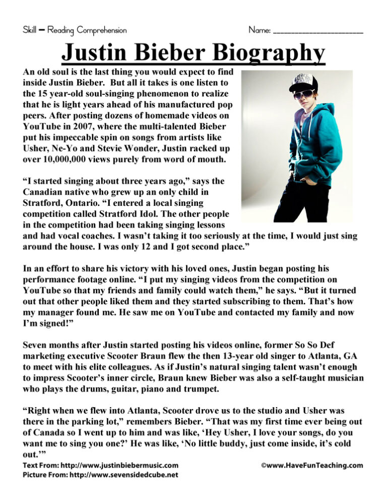
Justin Bieber Biography Reading Comprehension Worksheet

Third Grade Multiplication and Division Test Practice Worksheet
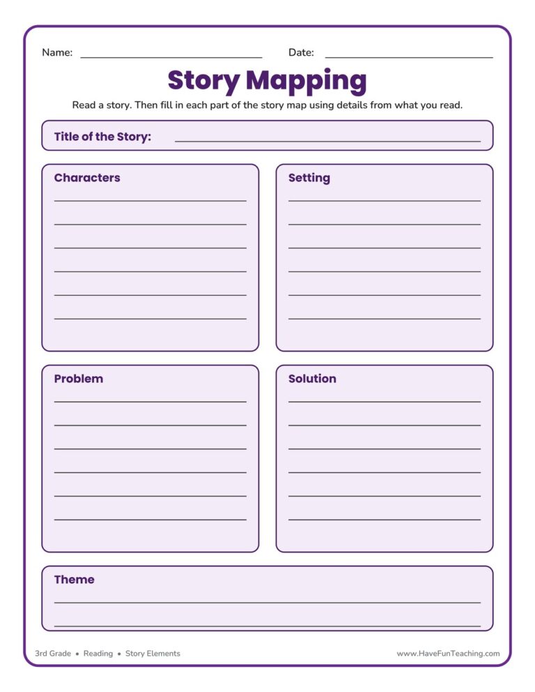
Story Map Graphic Organizer
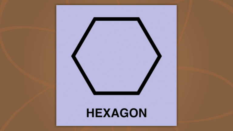
Hexagon Song (Original Music Video)
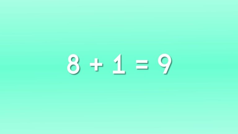
Adding 8 Song (Lyric Music Video)
The same catalogue, for the other question. Grid answers “which of these looks right?”; list answers “which of these IS right?” — it trades the big page for a description and the full taxonomy on every row. She switches to it once she has already narrowed and is comparing four near-identical worksheets.
Justin Bieber Biography Reading Comprehension Worksheet
A one-page biography with five comprehension questions — read it, answer it, done.
Third Grade Multiplication and Division Test Practice Worksheet
Mixed multiplication and division practice in the test format they will actually see.
Story Map Graphic Organizer
Beginning, middle, end — the map they fill in after any read-aloud.
Hexagon Song (Original Music Video)
Two minutes of shapes, sung. Play it twice and they have it.
Adding 8 Song (Lyric Music Video)
The +8 facts as a chorus. Free, so she can try one before she buys ten.
The subject axis is deliberately short. Six colours is a legend she can hold; fourteen would just be the grade map again in a different order.
| Subject | Chip | Source hex | Chip hex | White text | Note |
|---|---|---|---|---|---|
| Phonics (incl. Alphabet) | Phonics (incl. Alphabet) | #CC2E2E | #CC2E2E | 4.71 : 1 ✓ | source |
| Reading · Writing | Reading · Writing | #7A3FA8 | #7A3FA8 | 5.66 : 1 ✓ | source |
| ELA · Holidays | ELA · Holidays | #34B26A | #247A49 | 4.54 : 1 ✓ | deepened — 2.7 : 1 at source |
| Math | Math | #0758A1 | #0758A1 | 6.02 : 1 ✓ | source |
| Science | Science | #D2470B | #C3420A | 4.51 : 1 ✓ | nudged for the alpha |
| Social Studies (+ Specials) | Social Studies (+ Specials) | #F0619E | #B04774 | 4.52 : 1 ✓ | deepened — 3.0 : 1 at source |
Every card gets one. But a favorite is a secondary, low-commitment action — it must never argue with “View Resource.” So it is small, and it lives in the header band — never a 44px outline sitting beside the button at equal weight, which reads as two buttons and no answer.
✕ Rejected — overlay on the image
The Pinterest/Etsy convention, and wrong here. Our thumbnail is the product. She judges a worksheet by reading it — the top-right corner is where the “Name / Date” fields live. A floating heart chip covers the very thing she’s evaluating, and on a light worksheet scan a white heart disappears entirely.
✕ Rejected — beside the button
It steals horizontal space from the CTA, forcing “Download” to shrink. And at equal size it reads as an equal choice — two buttons, no answer to “what do I do next?”
✓ Chosen — right of the header band
The band’s right side is dead space. The heart is always in the same place across a 24-card scroll, contrasts hard against every accent, never occludes the resource, and gives the CTA its full width back. It costs zero vertical height.
aria-pressed and a label that flips to “Remove from favorites.”Tap any heart above — the real thing fires at the bottom of your screen. The toast has one job: confirm the save, and offer the way back. It is brand navy, pinned bottom-centre, and it always offers Undo.
Note the corners. The toast is a 16px rounded rectangle, not a pill — see 06 — Radius encodes function. A pill container wrapping a pill Undo button is two identical shapes nested, and the whole toast starts to look pressable. It isn’t. Surface = 16px, action = pill.
✕ Rejected — the generic toast
Generic dark slate — not a brand color. Floating over the middle of the page, covering the headline she was reading. No undo, so a fat-finger tap is permanent. And “Added to favorites” is passive — it describes the system, not her.
✓ Chosen — the HFT toast
Brand navy pill, Nunito 800, pinned bottom-center where nothing lives. White circle + pink heart — the same heart she just tapped, so the confirmation looks like the action. And an Undo that actually reverts the card.
role="status" + aria-live="polite". A screen reader announces the save without stealing focus mid-scroll. Focus stays on the heart she tapped — never move focus into the toast.Radius, spacing & elevation
Radius encodes function. In this system a shape is a promise: a pill can be tapped, a rounded rectangle cannot. Everything interactive — buttons, tags, toggles, the Undo — is a full pill. Everything that holds things — cards, panels, the toast — takes the 16px surface radius. Follow that one rule and she never has to learn our UI; she can feel where to press.
Built to WCAG AA
Most of our audience browses on a phone, often tired, often at night. Every filled button and every tag carries white text. The only exceptions are outline buttons (navy on white) and Buy on Amazon (navy on sail yellow). That means every interactive color has to be dark enough to earn it.
#F26E5F is the bright face you see in illustration and tints; orange #D2470B is the same color deep enough to put white words on. Never white text on coral. Never coral on a button.CSS variables (copy & paste)
Drop these into the theme, Elementor custom CSS, or global settings to roll out v3 consistently. Note the split between display colors (the bright sails — decoration only) and surface colors (deep enough to carry white text). Mixing them up is the one way to break accessibility here.
Design token CSS72 lines · click to expand
/* Have Fun Teaching — Design Tokens v3 (Fun & Interactive) · Oct 2026
   Live sources: hft-brand-2026.css (colours, type, radius) · hft-buttons.css (buttons, loaded last)
   · hft-free.css (.hft-fb-* page components). */
:root{
  /* ---- SURFACES: anything with white text on it ---- */
  --navy-900:#12305A;  --navy:#1B437D;      /* PRIMARY — the wordmark */
  --blue:#0758A1;
  --cta:#D6337B;       --cta-hover:#B62A67; /* THE button colour */
  --cta-edge:#A4235C;                       /* pressable bottom edge */
  --cta-trial-hover:#B62A67;                /* .hft-shine trial buttons — same as --cta-hover since 1.0.430 */
  --green-deep:#1F8551;
  --purple:#7A3FA8;    --purple-700:#633389;/* music & sound — Songs */
  --plum:#5A2385;                           /* Game | Printable PDF switch, join-box edge */
  --arcade-teal:#007C89;                    /* Games */
  --interactive:#7A6459;                    /* Interactive format */
  --red:#CC2E2E;       --red-700:#A82525;   /* watch & play — Videos. NOT the error colour */
  --orange:#D2470B;    --orange-600:#B03C09;
  --slate:#5A6B7D;

  /* ---- DISPLAY: illustration, tints, highlights. NEVER white text on these ---- */
  --sail-yellow:#FBB915;  /* swash, checks, stickers, Buy on Amazon (navy text) */
  --sail-green:#34B26A;
  --sail-pink:#F0619E;
  --coral:#F26E5F;        /* ink text only */

  /* ---- Neutrals ---- */
  --ink:#231F20; --body:#3d4a57; --muted:#93A0AD;
  --cream-50:#FFFCF6; --cream:#FBF5EC; --cream-200:#EEE6DA; --line:#E9E0D4;

  /* ---- Type ---- */
  --font-display:'Fredoka',system-ui,sans-serif;       /* headings, kickers, stickers */
  --font-body:'Nunito Sans',system-ui,sans-serif;      /* body + every button */
  --font-serif:'Source Serif 4',Georgia,serif;         /* product titles, quotes, long reads */

  /* ---- Shape & depth ---- */
  --r-sm:10px; --r-md:16px; --r-card:24px; --r-band:30px;
  --r-pill:999px;                                      /* a TRUE pill, never 30px */
  --shadow:0 18px 40px -18px rgba(27,67,125,.35),0 4px 10px rgba(27,67,125,.06);

  /* ---- Buttons ---- */
  --btn-h:52px;            /* everywhere · header & drawer 44 · tables 40 · kids 64 */
  --buy:#D6337B;           /* RETIRED role — now the main pink */
}

/* MAIN — pink, white, pressable edge. Hover darkens, never moves. */
.btn-main{
  display:inline-flex; align-items:center; justify-content:center; gap:8px;
  min-height:var(--btn-h); padding:0 28px; border:0; border-radius:var(--r-pill);
  background:var(--cta); color:#fff; font:800 16px/1.15 var(--font-body);
  box-shadow:0 4px 0 var(--cta-edge);
  transition:transform .1s ease, box-shadow .1s ease, background-color .15s ease;
}
.btn-main:hover{ background:var(--cta-hover); }
.btn-main:active{ transform:translateY(3px); box-shadow:0 1px 0 var(--cta-edge); }
.btn-main:disabled{ opacity:.55; box-shadow:none; }

/* SECONDARY — white, navy outline, flat */
.btn-sec{
  min-height:var(--btn-h); padding:0 26px; border-radius:var(--r-pill);
  background:#fff; color:var(--navy); border:2px solid var(--navy); box-shadow:none;
  font:800 16px/1.15 var(--font-body);
}
.btn-sec:hover{ background:var(--navy); color:#fff; }

/* TRY FREE — the secondary look with a pink ▶ icon */
.btn-try svg{ color:var(--cta); fill:var(--cta); }

/* AMAZON — the only yellow button */
.btn-amazon{ background:var(--sail-yellow); color:var(--navy); border-radius:var(--r-pill); min-height:var(--btn-h); }

/* Focus, everywhere */
:is(.btn-main,.btn-sec,.btn-amazon):focus-visible{ outline:3px solid var(--navy); outline-offset:3px; }
Logos & fonts in one place
Every version of the Have Fun Teaching logo and pinwheel, as clean SVG traced from the approved master (no fonts needed to render it) plus transparent PNGs. Right‑click → Save, or use the links. Want everything? The logo kit zip has every version of both logos in SVG, PDF, PNG and JPG at every size, the full favicon set, social images and a README.
Full logo
The default logo. SVG.
⬇ Sticker (main) ⬇ Full color ⬇ No sticker edge ⬇ Grayscale ⬇ Black ⬇ White ⬇ Blue ⬇ Black & whitePinwheel
Icon only — avatars, stickers, corners. SVG.
⬇ Full color ⬇ No sticker edge ⬇ Grayscale ⬇ Black ⬇ White ⬇ Black & whiteFavicon & app icons
Tab‑tuned pinwheel. Full set (ico, manifest, head snippet) in the zip.
⬇ Favicon SVG ⬇ 32px PNG ⬇ Apple touch 180px ⬇ Site Icon 512pxRaster (PNG)
Transparent, 2400px wide, for decks & docs.
⬇ Sticker logo ⬇ Full color ⬇ White ⬇ Black ⬇ Pinwheel 1024pxSocial images
1200×630 og:image, profile pictures, banners.
⬇ Share image (blue) ⬇ Share image (white) ⬇ Profile picture — pinwheel ⬇ Profile picture — full logo ⬇ Banner (white) ⬇ Banner (blue)Fonts
Wordmark & headings = Fredoka (OFL) · Body & UI = Nunito Sans · Reading = Source Serif 4. Three fonts, three jobs.
⬇ Fredoka⬇ Nunito Sans⬇ Source Serif 4One file. The whole brand.
Exports this page — every rule, color, token and component — as a single self-contained HTML file you can email to a designer, a freelancer or a printer. No fonts to install, no assets to zip, no login. It opens in any browser and it is always in sync with this page, because it is this page.