

Average State Temperatures Graphing Worksheet
This average state temperatures graphing worksheet has 4th graders read a scaled bar graph of monthly temperatures, then find the average of four of them. Answer key included, so data practice takes no prep.
$6.97
Or free with a membership — members pay $3.33/mo for all 10,000+ resources. See plans
Want this one free?
Tell us where to send it and it’s yours — no card, no catch.
One free resource per teacher. We’ll also send free teaching ideas each week — unsubscribe anytime.
Teaching is easier with a membership
Unlimited printables, games & videos for PreK–6th — for your classroom or homeschool. Cancel anytime.
Start your 3-day free trial$0 today · cancel anytime · Instant access to 10,000+ resources
About this resource
Description
Reading a bar graph is one of the first real data skills a student uses outside of math class, and temperature is the data every child already knows something about. This average state temperatures graphing worksheet gives fourth graders a scaled bar graph of the average monthly temperature in Ohio and asks them to pull real answers out of it: which month is coldest, which two months match, and how many degrees separate one bar from another. Then it goes a step further and asks them to find the average of a set of those temperatures, so reading data and summarizing data happen on the same page.
This 4th grade graphing worksheet is a single print-ready page with a complete answer key. Part A holds four questions about the graph, each with a wide writing line, and Part B holds two averaging problems in roomy work boxes where students add four temperatures and divide by four. Use it as a warm-up after a lesson on bar graphs, as independent practice during a weather or seasons unit, or as a quick check before a data test. Everything a student needs to answer is on the page, so it works just as well for homework or a substitute folder as it does in class.
What’s Included
- 1 print-ready PDF worksheet
- Answer key
- 1 scaled bar graph of six months of average temperature data
- 4 graph-reading questions and 2 four-number averaging problems
Three things make this average state temperatures graphing worksheet work for kids. First, the graph is scaled in tens with light rules every five degrees, so students have to read a value that does not sit on a labeled line – the exact skill a test question asks for. Second, the comparison questions require two readings and a subtraction, which turns a one-step lookup into genuine multi-step reasoning. Third, the averaging problems reuse the same six temperatures the students just read, so finding the mean feels like a natural next question about their own data rather than an unrelated computation drill.
Extend the lesson by having students track the temperature outside your classroom for two weeks, then build their own bar graph and find the weekly average. Compare your state’s numbers to Ohio’s and talk about why they differ. At home, a parent can pull up a seven-day forecast and ask a child to predict the week’s average before checking it. Older students can graph two states side by side and explain which one has the bigger swing between March and August.
Related Resources
What teachers say
Reviews
You must be logged in to post a review.

This Finding Averages Number Set Worksheet gives 4th Grade students three real-world number sets to add and divide, with roomy work boxes and a full answer key for quick checking.
A printable, ready-to-use blank calendar with a landscape monthly grid and labeled day columns. Great for Kindergarten through 5th grade classrooms to map out lessons, holidays, and daily routines—just add the month and the dates.
Using the Counting Songs (Classic Video Collection), students practice skip counting by all of the numbers by singing and counting along to these thirteen videos.
A 4th grade long division worksheet with nine three-digit-by-one-digit problems and roomy space to show each step. Includes a complete answer key for quick, no-prep division practice at home or school.
A place value identification worksheet for 4th grade: name the value of circled digits through the millions, build numbers in standard form, and explain ten times as much. Answer key included for no-prep practice.
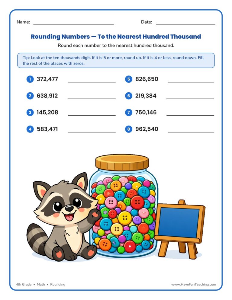
This Rounding to the Nearest Hundred Thousand Worksheet gives 4th graders focused practice rounding six-digit numbers using place value. An answer key is included, making it a quick, no-prep way to build confident number sense.
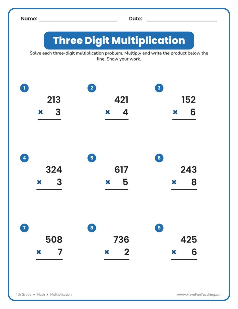
Build multiplication fluency with this Three Digit Multiplication Worksheet for 4th grade. Students multiply three-digit numbers by one digit across nine column problems, with a full answer key included for quick, no-prep practice.
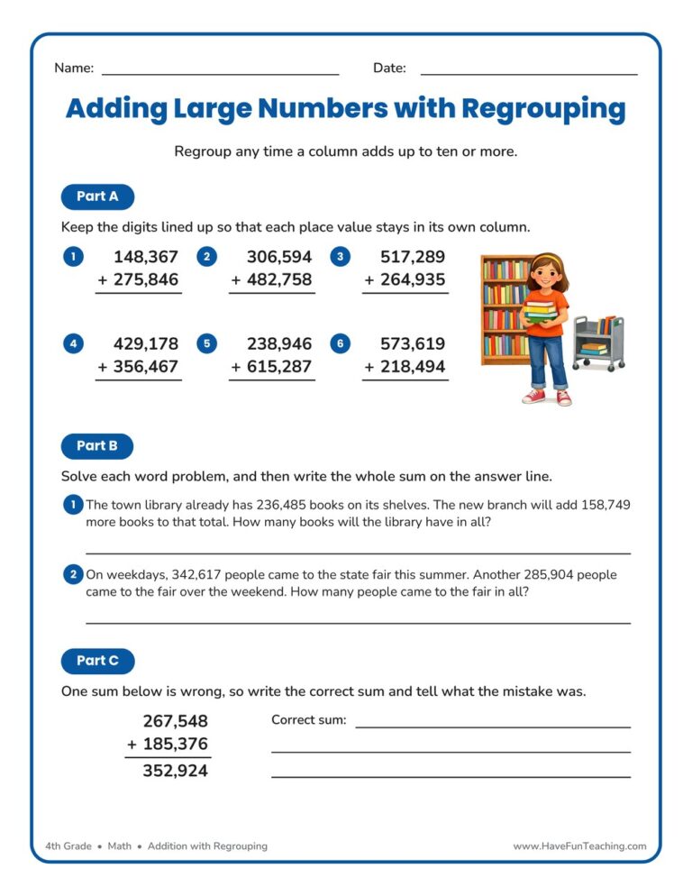
This Add Hundred Thousands Regrouping Worksheet gives 4th graders six-digit column addition, two real-world word problems, and an error-analysis task. Answer key included, so you get no-prep practice that builds real accuracy.
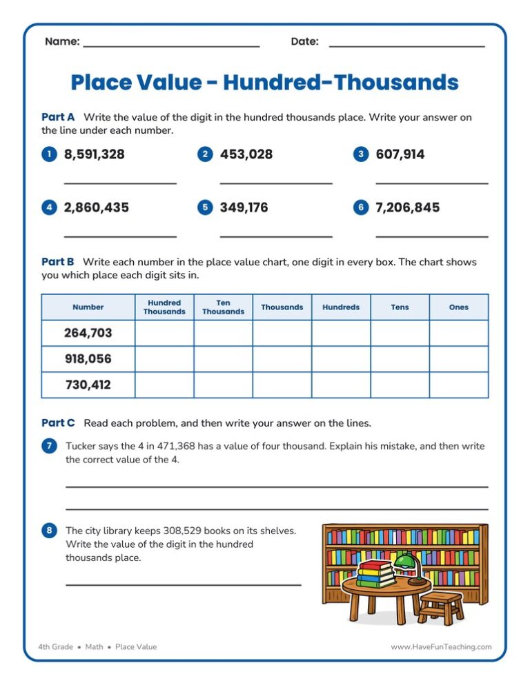
This hundred thousands place value worksheet gives 4th graders six digit-value problems, a six-column place value chart, and a written error-analysis question. Answer key included, so checking work takes seconds.
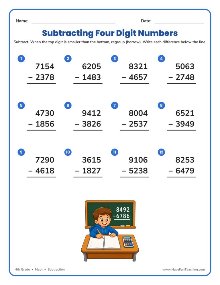
This 4th grade four digit subtraction regrouping worksheet gives students twelve vertical problems that all require borrowing, with a complete answer key included—perfect for quick, no-prep multi-digit subtraction practice.

This Solving Area Word Problems Worksheet gives 4th graders six real-world rectangle problems to solve by multiplying length and width. Includes labeled diagrams and a complete answer key — perfect for no-prep area practice at home or school.
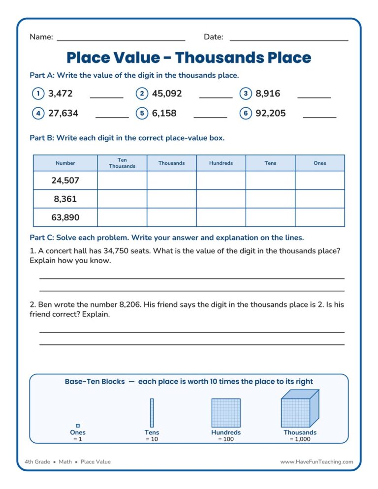
This Thousands Place Value Worksheet gives 4th grade students practice finding the value of the digit in the thousands place, filling in a place-value chart, and explaining their reasoning. An answer key is included to make checking fast.

Reviews
There are no reviews yet